PARCO ART & CULTURE DAYS" was held at PARCO, which continues to be a "source" of fashion and culture. Following VOL.1 in Tokyo, VOL.2 will report on the events held in Sapporo. VOL.2 reports on the exhibition by Takenobu Igarashi, which was held at the same time to commemorate the 50th anniversary of Sapporo PARCO's opening.
Photo_Yuco Nakamura
Edit & Text_Akiko Maeda
DATE:11.5.Wed @PARCO SAPPORO
Igarashi logo
Retrospective exhibition in the Sapporo Parco building.

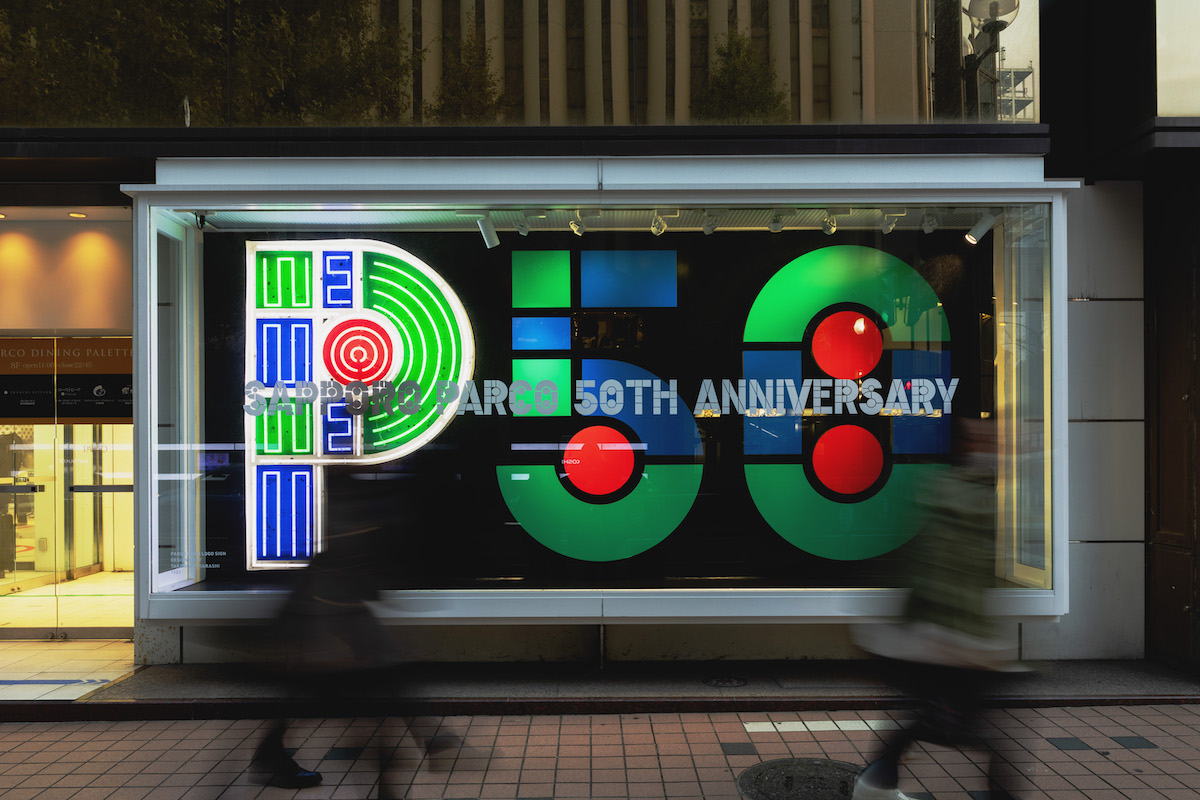
PARCO ART & CULTURE DAYS" has been a great success at PARCO locations nationwide. This time, we will report on the exhibition by Takenobu Igarashi at Sapporo PARCO's 50th anniversary exhibition! We will report on Takenobu Igarashi's exhibition held to commemorate the 50th anniversary of Sapporo PARCO.
Takenobu Igarashi is an internationally renowned designer and sculptor from Takikawa, Hokkaido, Japan. His major works include the calendar for the Museum of Modern Art in New York, corporate logos for Calpis, Meiji Dairies and Summit, and the logo for Tama Art University.
He is also famous for his work on the logo for the JR Tower at Sapporo Station and the station's symbolic star clock. And his involvement with PARCO began with the Shibuya PARCO PART3 project, which opened in 1981. He designed the entrance sign, rooftop neon sign, shopping bags, and many other items, and is the creator of the PARCO logo, which is indispensable to the history of PARCO.
The "Igarashi logo," commonly known as the "Igarashi logo" designed by Mr. Igarashi for the opening of Shibuya Parco PART3, which could be seen at the "A-Z Homage to Takenobu Igarashi" exhibition held at "SPACE7" on the 7th floor of the building. The photo shows the wooden doorknob sign used at Matsumoto PARCO until February 2025. The "Igarashi Logo" can still be seen today as a permanent neon sign at Shibuya PARCO and Shinsaibashi PARCO, as well as on exterior signs at Kichijoji PARCO and Nagoya PARCO.
Alphabets made of ABS resin. The drawings displayed along with the works show Mr. Igarashi's handiwork as a designer.
In fact, Mr. Igarashi's connection with Parco began shortly before the opening of Shibuya Parco PART3, with an exhibition in which he presented an alphabet sculpture. Interior designer Shiro Kuramata, who was collaborating on the Shibuya PARCO PART3 project, approached Igarashi to design the logo. We also held an exhibition of the new alphabet sculpture series in the show window outside the store, which we called a street gallery.
A total of 30 pieces were presented in six different series and finishes, including two types of ABS resin, concrete, mirror, wood, and chrome plating. A different series was exhibited each week, and the materials from that time depict how passersby stopped to look at them.
Mr. Igarashi applied the "axonometric drawing method," which was one of the drawing methods used in architecture and interior design, to graphic design to express three-dimensional letters. It is noteworthy that the designers who inherited Mr. Igarashi's ideas found and reinterpreted the original "P," "A," "R," "C," "O," "T," and "3" to create the remaining letters and numbers in this exhibition.
Other exhibits included valuable materials related to "Hajimari no Kaze: Takenobu Igarashi no Kotoba no Ibuki," a book of more than 2,000 words that Mr. Igarashi transmitted on Twitter (now X) when he became president of Tama Art University, providing a glimpse into his thought process.
A number of goods featuring the "Igarashi logo" were displayed and sold at the gallery store attached to the exhibition.
STEPS 207, a staircase gallery, is the setting.
Igarashi's works are gathered!
The other venue for the exhibition was the Sapporo Parco Stair Gallery, named "STEPS 207" after the number of steps in the staircase. Except for the "B" sculpture, the works on display in "STEPS 207" are homages to Igarashi's original works, which were newly created for this exhibition. Starting from the B2 floor, which has a second main entrance directly connected to the subway exit, and extending to the 7th floor, a total of 9 floors of stairs will be used to display approximately 50 works, including sculptures, graphic design posters and photographs based on the A to Z alphabet. The exhibition was a luxurious experience that could be enjoyed together with selected words from the book "Hajimari no Kaze: Igarashi Takenobu no Kotoba no Ibuki" (Wind of Beginning: Igarashi Takenobu's Words), which was introduced earlier.
Originally, there was a floor sign created by Mr. Igarashi at the landing of the staircase, which together with the floor sign, made for an impressive exhibition space. The red and green lines on the floor led visitors to each of the exhibition spaces, an original idea that is typical of PARCO.
The message "The extraordinary is good, but we have to do something about the everyday" was displayed on the 2nd and 3rd floors of the exhibition space. The work on display with the message, "Aluminum Alphabet E," is a photographic work by Megumi Wada. Megumi Wada's photographic work captured the flat shadows cast on the ground by the intricately shaped alphabet sculptures.
Next, on the 3rd and 4th floors, the well-known "PARCO Logo R" (left), "Silkscreen Alphabet Q" (center), and "Folded Alphabet N" (right: newly created based on the original) were displayed. A graphic on the wall showed various ways to fold the "N" in plan view.
The newly created "Mirror Alphabet W" based on the original is a unique work in which the "W" is completed by looking into a mirror reflecting the "V". It also strangely matches the striped pattern originally painted on the wall of the landing.
In conjunction with MUJI Embroidery Studio
Experience the rare embroidery of the Igarashi logo.
The highlight of the event is not only this. In conjunction with MUJI's embroidery studio, the Igarashi logo will be available for embroidery on fabric products of your choice. The new 26 letters from A-Z will be available in red, blue, and green or 10 single colors and in three sizes (large, medium, and small). This event is scheduled to run until the end of February next year, so if you missed the exhibition this time, you can visit MUJI on the 5th and 6th floors of Sapporo Parco.
Sapporo PARCO will stand at a new starting point on the occasion of its 50th anniversary, and will continue to take on the challenge of constantly envisioning a new era as a cultural center in the northern land.
Sapporo Parco
Address: 3-3 Nishi, Minami 1-jo, Chuo-ku, Sapporo
Hours: 10:00 - 20:00
Official HP
Official Instagram