Go for it. My shot in the dark actually got an unexpected “yes”!
—How did this collaboration come about?
Kobayashi: If you think about it logically, this collaboration is a completely out-of-the-box idea (lol). However, ideas like this actually come up quite often in BEAMS’ planning meetings. While most of them never see the light of day, when I looked into JANSPORTS and Eastpak, I discovered they’re both under the same umbrella—VF Corporation—so I decided to give it a shot, even if it seemed like a long shot.
I see.
Kobayashi: To be honest, I thought it would be difficult, but since it coincided with BEAMS’ 50th anniversary, I reached out to see if there was anything we could do. To my surprise, they agreed immediately. I received an email with a photo of the JanSport and Eastpak representatives shaking hands at their headquarters in Colorado, along with a message saying, “We approve this project,” and I was truly surprised.
—What was everyone’s reaction when you received notification that the project had been approved?
Kobayashi: The folks at Japan’s “Jan Sports” were really surprised, too. After that, we all discussed the finer details, and the collaboration project moved forward.
—What was the rationale behind selecting the base model?
Kobayashi: If I keep this up, I'll just keep talking (lol)
Stream: Still, Koba-san, I'm counting on you (lol)

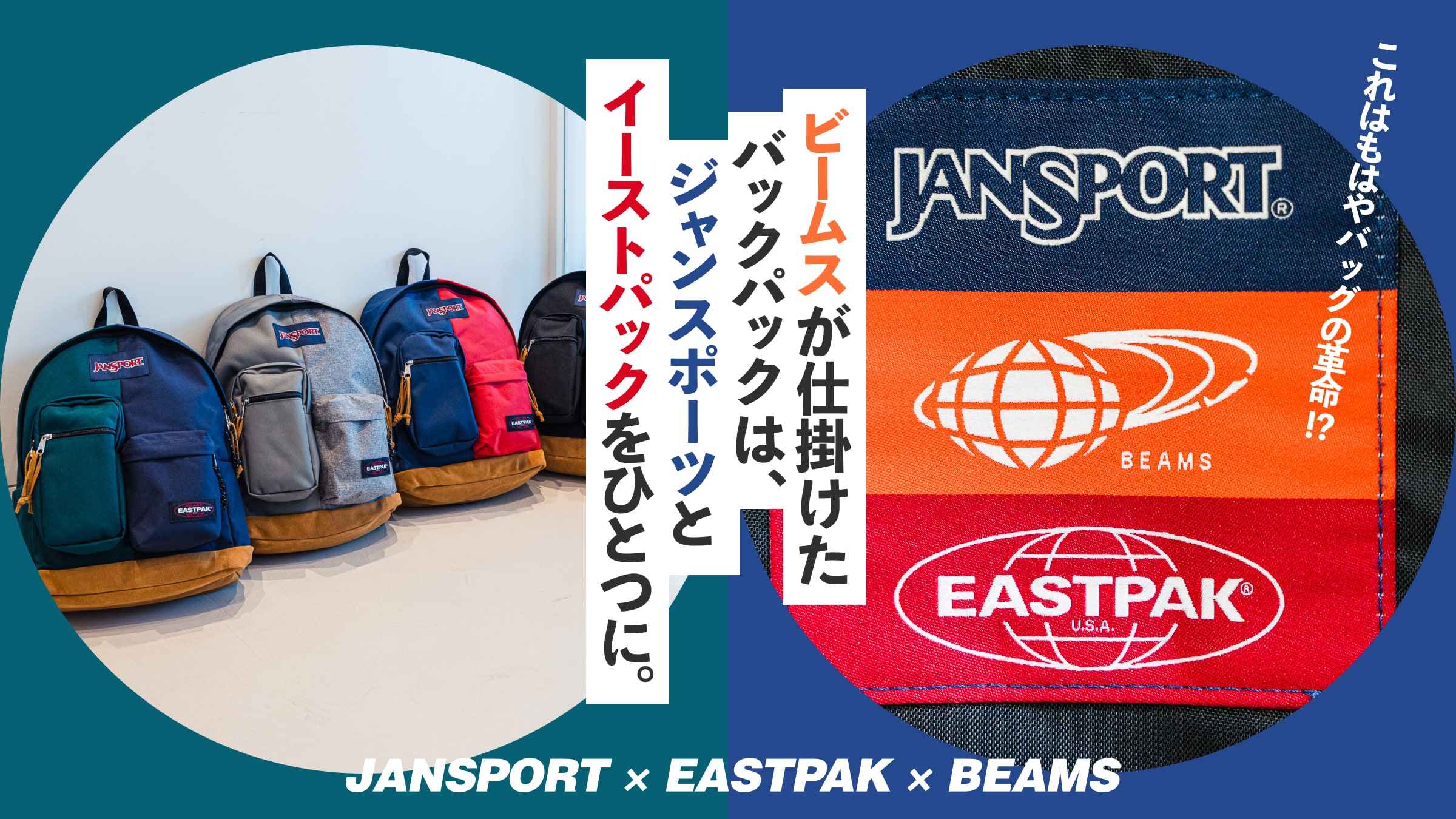
Kobayashi: This time, we chose models that could be considered the face of both brands: the “Right Pack” from JanSport and the “Padded Pak’R” from Eastpak. I felt that combining these two iconic models would result in something really interesting, so I hardly even considered any other options.
—What was the most challenging part when combining designs and colors?
Kobayashi: It was really hard to get the heights to line up when combining the pockets of the two models. The manufacturer handled the rest well, but I did have some trouble matching the colors at the very end.
Kawakai: Yes, it was.
Kobayashi: We had already decided on a plan where two of the four colors would feature a bold pattern, while the other two would be solid colors. So, when we asked the manufacturer to produce the first samples without specifying exact colors, the only ones they sent back were “Navy × Scarlet Red.”
Kawakai: We had originally planned to make minor adjustments from there, but since the color scheme of the first sample matched the image we had in mind for *Beams Boy*, we decided to go with it as is.
Kobayashi: From there, we settled on “Deep Juniper × Ultra Marine,” which features the deep green that symbolizes , and “Black × Black,” since we couldn’t leave out the ever-popular black. I did struggle a bit with the final color, though.
—So that final color was “Graphite Grey × Sunday Grey,” wasn’t it? How did you decide on this color combination?
Kobayashi: Originally, I had planned to match the colors using navy instead of gray. However, while looking at the swatches, I remembered that Eastpak’s “Sunday Grey” was also an iconic color that represents the brand. From there, I searched for a shade of gray that would complement it well, and ultimately settled on this color combination. It was a bit of a struggle, but personally, this color scheme is my favorite.
Combining “Deep Juniper” (green)—the signature color of —with ’s navy shade “Ultra Marine” to create a Black Watch pattern. The pockets are divided exactly in half according to each brand’s specifications, making this design truly iconic. From the zipper pull tabs and shoulder straps to the cleverly placed pocket on the back panel, every detail is infused with the unique signatures of both brands—and the distinctive touch of .