. all to improve the image of rugby.
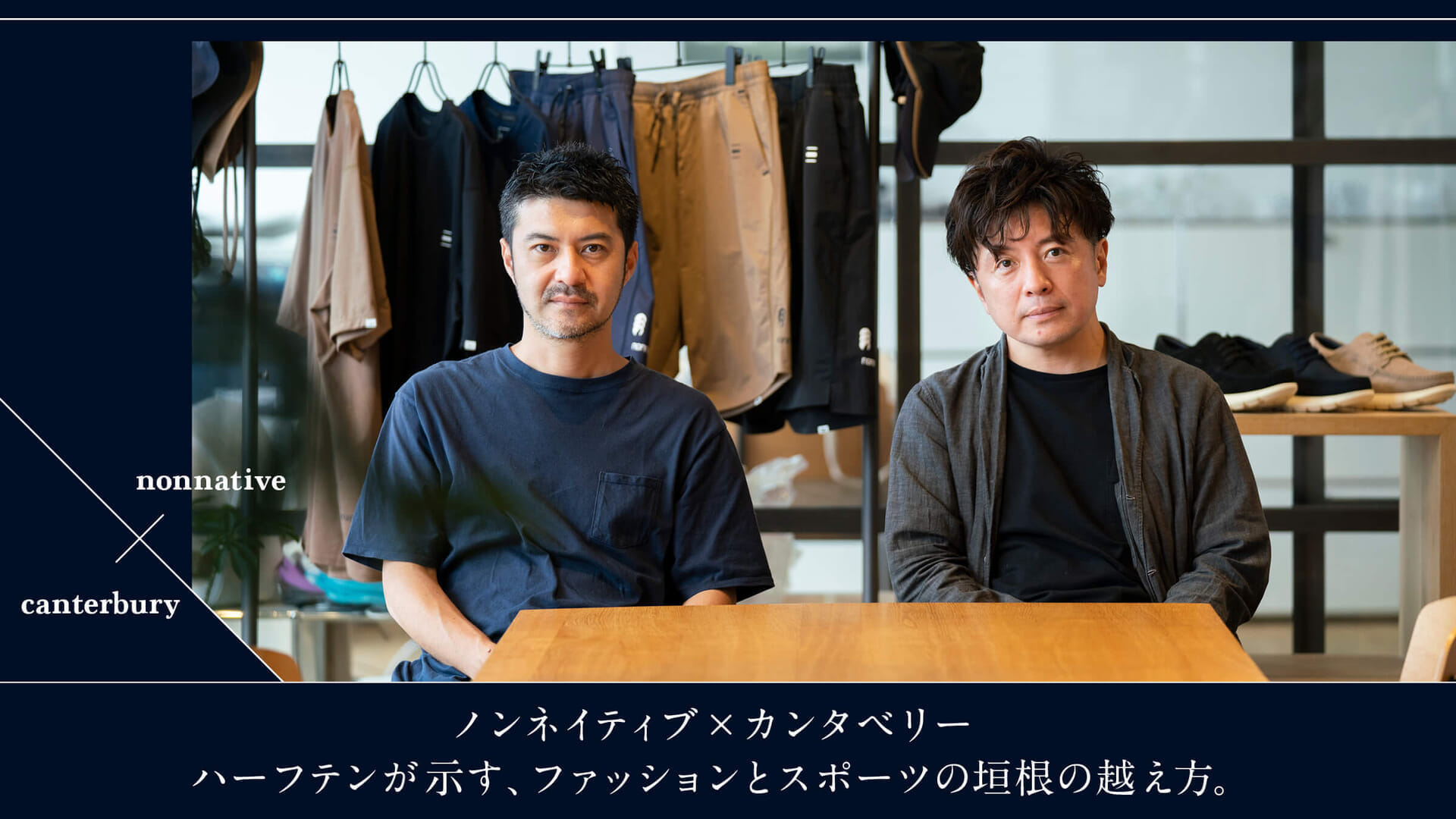
Non-native" and "Canterbury" and Mr. Fujii and rugby may come as a surprise to many, so please tell us about the background of the project first.
Fujii:I was approached after the World Cup in Japan in 2019. . it was a time when I had personally been to New Zealand many times.
Rugby is part of the New Zealand culture, and it is also the home country of "Canterbury. Non-Native's 39th collection is also inspired by New Zealand, and the graphics for the collection were drawn by local musician Lord Echo. Recently, I was also impressed by the visuals of New Zealand rugby player Dan Carter styled by "Non-Native" for "THE NEW ORDER MAGAZINE". In that sense, it was a natural progression.

Fujii:Oh, yes. I actually went to the "Canterbury" region. I accepted this project because Canterbury was not doing anything with other brands. It has not yet been colored. It is not well known in the fashion genre, but the brand's logo is visually recognized in the uniforms of the Japanese national team, for example. . At first, the proposal was a collaboration, but collaborations are often a one-time thing, aren't they? Instead, we wanted to create excitement for the World Cup in France to be held in 2023, so the plan changed to creating a new category.
Ishizuka:What impressed me was that we started with the idea of making rugby cool. Canterbury" has a background in rugby, and we are working on branding with that in mind, but even after the World Cup 2019, we have not been able to break out of that realm. In fact, our clothes are actually worn when watching rugby matches or playing sports, and in other scenes that are connected to rugby. In that sense, we wanted to make a breakthrough through collaboration with a fashion brand. That is how I came across Mr. Fujii. I knew "non-native" personally and had shopped at "vendor," so I think it was important that we were able to have a lively conversation.
Fujii:People tend to think that the designers of "Canterbury" wear lager shirts, but Mr. Ishizuka does not.
Ishizuka:Mr. Fujii told me, "Please don't come in a lager shirt today" (laughs).
Fujii:If I was going to wear it, I was going to have it swept up in a "School Wars" kind of way (laughs).
Like Shinji Yamashita (laughs). What did you have in mind when you launched "Half Ten"?
Fujii:The idea is to rework the existing "Canterbury" products. The idea was to create something between "Canterbury" and the "Rugby Plus" training line. We wanted to create something with a certain degree of solid design, something that could be worn in the city while still being wearable as spectator or training wear.
Ishizuka:As for the name of the brand, we wanted it to have the meaning of connecting Canterbury's domain with a new domain. For example, the position of half in soccer is the one that creates the game. In rugby, there are two positions: scrum half, number 9, and fly half, number 10.
Rugby positions are numbered, and number 10 is the standoff, right? Is it also called fly half?
Ishizuka:. rather, that's what we call them in Europe. The scrumhalf and flyhalf have the role of connecting the forwards and backs, and I thought I could make use of that in the name of the brand.
Canterbury has a nuanced relationship with both the project with "non-natives" and the theme of going beyond the realm of rugby.
Ishizuka:That's exactly what it is. Inspired by the position of "half" and the number "10," we named it "Half Ten.
Fujii:Half has the image of the middle and the nuance of having a bird's eye view, so it's a very good name.
. It's halften as a brand name, but it's also interesting to see the graphic design of the iconography.
Fujii:This logo is based on a bartack. Canterbury's products have three bar tacks to reinforce the sewing. I was very interested in this detail and wondered if it would be possible to create a logo from it.
Ishizuka:Canterbury's classic rugby jerseys have the original collar detail. It has been inherited from the mid-1900s, when the brand was founded. The part connecting the collar and the body is taped, and there are three-bar tuck stitches to reinforce the tape. Mr. Fujii said it was very iconic.
I see. I have the impression that the concept can be conveyed more easily by reducing it to three lines in this way. The middle line looks like a boundary line.
Fujii:Yes, that's right. The logo of "Canterbury" is also a New Zealand kiwi bird with three birds in a row, isn't it?
Ishizuka:. Since this is a brand created by three New Zealanders, the motif is based on the national bird, the kiwi.
Fujii:At Half Ten, the "Canterbury" logo, which is usually placed horizontally, is stacked vertically. The "Canterbury" logo is a symbol of rugby, so we decided to use that alone to convey the message.