It is more like it if you incorporate instinctive movements.
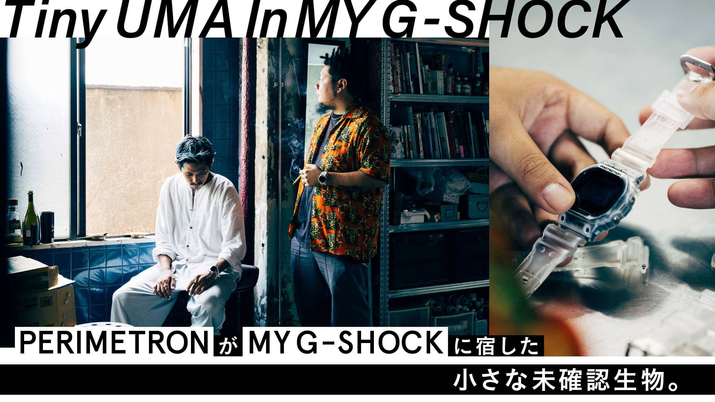
The theme of "MY G-SHOCK" created by the two is "UMA = unidentified animal. The parts are all clear, and abstract patterns with blurred outlines are drawn on them. When asked why he chose this theme, Mr. Mori opened up.

We thought hard about the meaning of what we were doing amidst the various regulations. We like products that have a story behind them, not only the watches but also the packaging, and we always aim for that when we are involved in design. That's when I saw the shape of this box and thought it looked a bit like an egg (laughs). (Laughs.) I thought, "It has a bit of a sci-fi feel to it, and I wondered what kind of clock would be interesting to create from this. I thought, "What kind of clock could be born from this?
As we discussed this, we gradually came to realize that there are creatures that are nudibranchs, have special colors, emit light, or have special shapes, and that even though they are from the earth, they seem to have been designed by someone else. I searched for images of such creatures, and the theme of "UMA" was born. We talked about how it would be great if we could design products with a sense of adding an organic image.
An unidentified animal born from an egg. The shape of the package is used to tell a story and create a design. Moreover, the unidentified animal that is born in this way is the creator of the user who customizes it.
The packaging and the back of the dials are engraved with the words "WE BRING EVERYTHING BACK TO LIFE". In other words, it means 'we breathe life into the product'" (Sasaki).
Once a great concept has been created, the design is the first thing to be considered. If the design is not well done, the concept will be ruined, but as one would expect from PERIMETRON, the clear parts are the core of the design, and it has been beautifully done in a UMA-like manner.
I searched a lot for images of nudibranchs and other such creatures as references. The wall in my office was a huge mess for a while (laughs). (Laughs.) I tried to draw various patterns from the images, looking at the transparency of the parts and the balance of colors that could be expressed. But I felt that it was a bit too calculated..." (Mori)
Although artificial beauty can be created by meticulously considering the overall balance, the concept this time was only about living organisms. Mori continues, "Organic beauty was not there.
I stopped thinking about it and let my hands do what they were supposed to do. I dared to include the blurring of the hands as they were, and as I did so, the design became more and more organic. I thought that since it is a living creature, it would be better to incorporate its instinctive movements to make it more like a living creature.
The abstract motif, in which dots gather to form a pattern rather than clearly drawn lines, enhances the sense of a living creature. . However, there are no eyes, mouths, or tentacles to be seen.
We talked about it together. If there are eyes or something like that, it would look like an imitation of a living creature. But I want them to be seen as a kind of life form, without depicting them as such.
I think I was able to create an interesting design. I think I did a good job of expressing the thinness and fineness of the print, which seems to have emerged from the parts, rather than being clearly printed. However, the differences in color are too exquisite (laughs).
But I think this pattern would be too strong if the colors are too bright. . I also didn't want it to interfere with fashion. I didn't want it to look just plain weird on my arm (laughs). So I chose colors that were easy to use and that I liked.