If I take Reebok's side, there will be no point for me to do it.

Once again, what did you start with in the design process?
I drew a pattern, but even so, there was a different exchange than the usual process. I was given a list of corporate colors and seasonal colors, but I thought they were just strong primary colors, but they weren't. There were quite a few seasonal colors, and I had to look at inline products for 2020.
Did you have a specific number of molds?
There were 26 models, including shoes this time, but that was just sort of a number and no specific number was decided.
This time, you designed for a sports brand, not a fashion brand. Was there any difficulty in doing so?
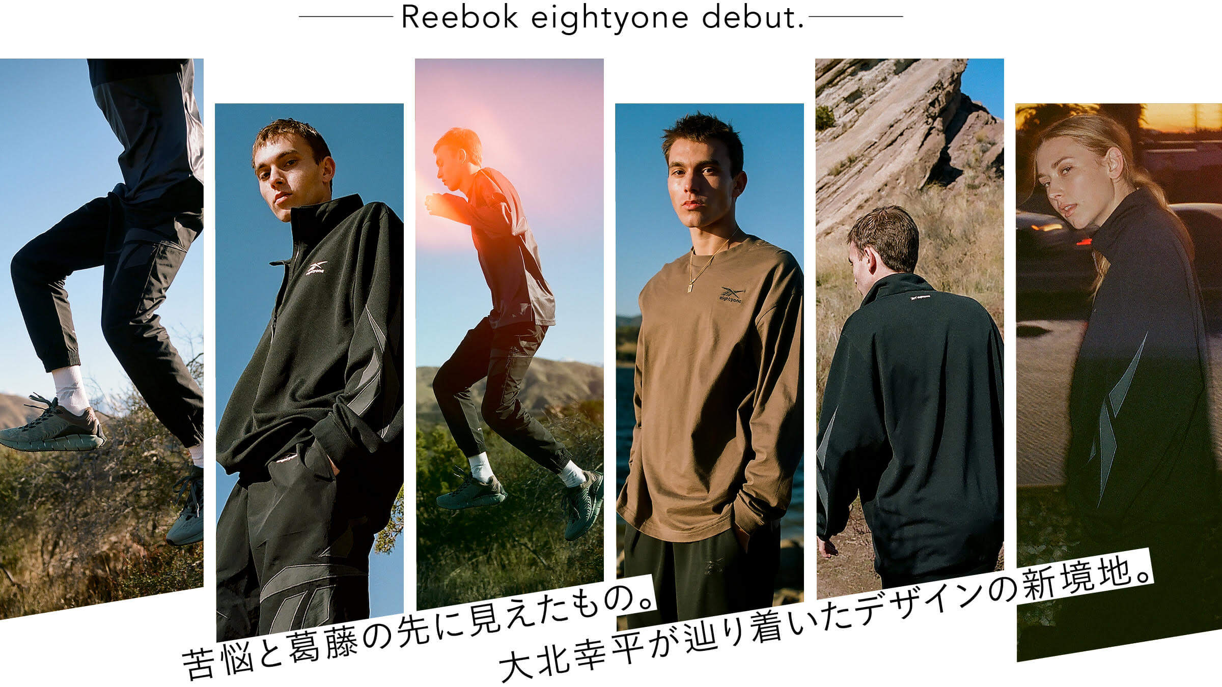
I have categorized it as "sports casual. If I categorized it as "sportswear," it would be out of my scope, and what I make would depend on the competition and the field. That is why I designed it for urban life.
I'm sure there were many difficulties during the design process.
It was about gaining the trust of the people at Reebok (laughs). I had to take an approrval within the company, so that presentation was difficult. To be honest, I am not good at presentations.... I often had to make things and show them to people, and then they would judge me on them. I would show them using a pattern and fabric, but I couldn't convey the image well. But I also didn't want to just use images I found on the web and say, "This is how it looks like.
How did you clear that up?
I managed to get through it with the support of the person in charge of inviting me, whom I mentioned earlier. Without that person, I am sure I would have fallen behind.
I also wanted to step up through this project, so I had to be flexible in my thinking.
Experience will help you step up as you broaden your design horizons.
What were you conscious of when working on the design?
Well, I don't know. I thought about where I could create a sense of discomfort. For example, we put pintucks on jersey pants. It would be nice if people could tell at a glance that something looks out of the ordinary.
I feel that the silhouette shows Ohkita's character. In particular, the top of the set-up has sleeves that are not set-in, a design not often seen elsewhere, and still has a voluminous feel.
I have always loved this kind of silhouette. It gives a beautiful shoulder line.
Reebok eightyone〉Jigkinetica ¥13,000+tax each
Did you choose the model of the shoes, too, Mr. Ohkita?
I chose this one from among a certain number of candidates.
The lineup is impressive in that it includes the Pump Fury, one of Reebok's most famous models, and the latest model, the Zigkinetica.
I like "Zigkinetica". It's a very unique shoe, in a good sense of the word. The charcoal gray color was specified as the same color for all of the shoes, but the color varies depending on the material, resulting in a nice gradation. In terms of the sense of discomfort I mentioned earlier, I used mint green on a dare. If it were black or white, it would have looked cool and stable, but I dared to use this color.
It's an unusual color.
When we made a special order of "Daytona DMX" for Vinyl Archive, we offered them in two colors: black and another rare color. They seemed to be well received by overseas customers, and it seems that people who are particular about fashion were wearing them. That made me very happy. I have never used this kind of color in the "Vinyl Archive" on its own, but when you realize through experience that this kind of color is also acceptable, it broadens your range, or in other words, it leads you to a step up.