For me, the number of editions is one criterion of value.
Selected by AnoLuck
Item01_ Minor Threat Parody T-Shirt

izmt:. I would like to start with the history of silk-screening when talking about T-shirts........
Hatanaka:izmt, that's going to be a long story , so it's okay for today (laughs).
izmt:I see , too bad. . let me introduce you to the T-shirts. First of all, this is just a T-shirt of a BMX shop, but as you can see, it is a parody of MINOR THREAT.
Nakano:PUSHER" is already a bad idea.
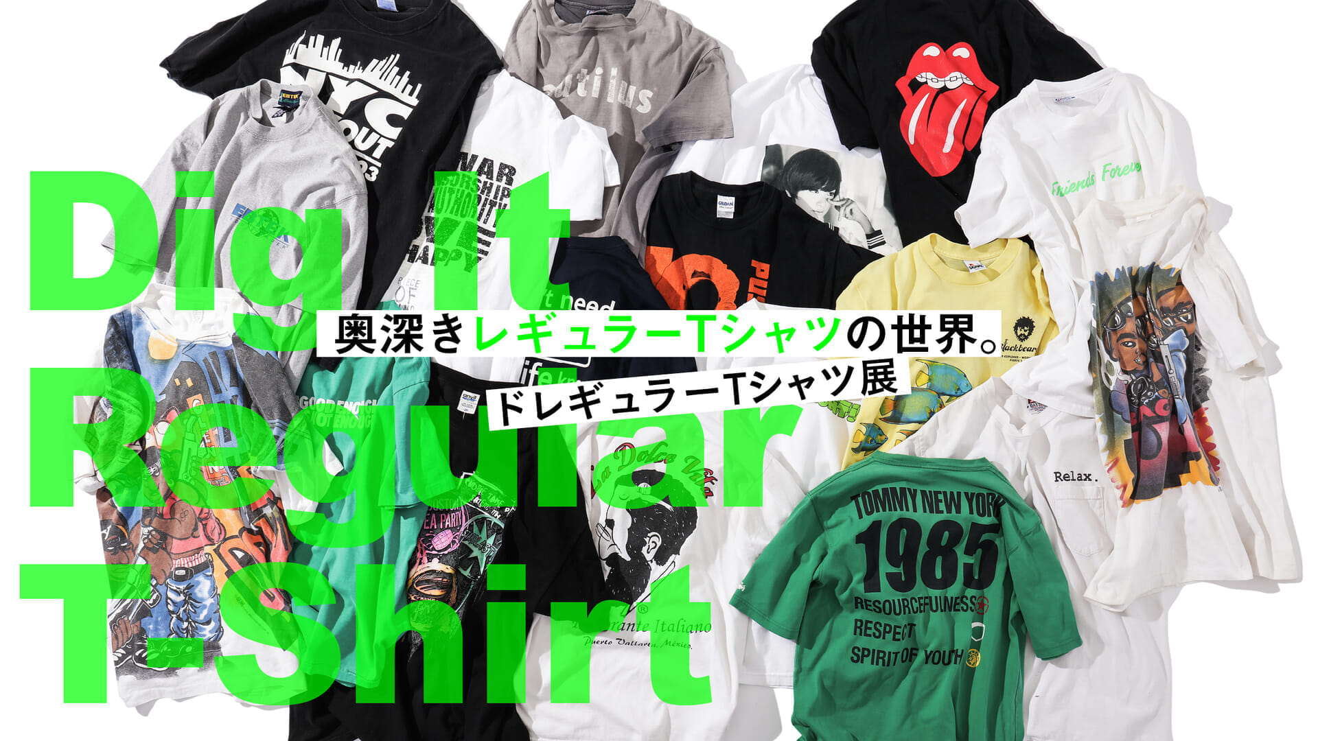
izmt:That's the name of the store, and it's in Colorado. The body is " Gildan " and it's not old and has no value as old clothes, but the design is just cool.

Nakano:It's the t-shirt I'd wear the most in real life. It's a size M , and I'd wear it just the way it's designed.
Hatanaka:And this isn't a picture, it's a photo. It looks slightly different from the minor thread too?
izmt:The original is shorts and "Vans" , so they must have re-shot it themselves. The quality of the parody is high. The sense of style is excellent.
Nakano:I'm really impressed with how elaborate it is. I think it's the coolest thing among all the items everyone brought today.
Item02_Fish Motif T-Shirt

izmt:. the next one is also bad. You often see T-shirts with fish prints on them, but those usually have a lot of colors and require a lot of ink and printing plates, so they are very difficult to make.
Hatanaka:. the colors are beautiful on this T-shirt, too.
izmt:. I thought it would be interesting to see it from that perspective. Is it a company logo on the chest? If only one of them was printed, it would be insufficient and the impression would be different. Besides, the black mustache looks like a pirate. It looks like he might be a poacher or something (laughs).
Hatanaka:. beautiful tropical fish (laughs). (Laughs.) They printed about five editions of the fish alone. That's amazing.

izmt:I'd say 5 or 6 editions . Personally, I think that one of my value judgments is that more editions = better. . Simply put, more editions means more difficult to make. . Moreover, the fish print on this one goes all the way around to the back....
Nakano:It's not easy to come up with this composition either. It is uncomfortable in a good way.
izmt:I like the fact that it is not in the middle, not where it should be. I feel that this feeling is connected to the street graphics of today, including "Off-White" and others.
Item03_Nautiius T-Shirt

izmt:Next is the Nautilus. Remember the Nautilus in "Nadia of the Mysterious Sea"? The word "Nautilus" comes from the nautilus, which is often used for submarines and the like, but the fact that it has such a strong name and a battered body is interesting. When you touch it, it's so flimsy. It's so flimsy to the touch that it doesn't even stand up as a fabric.
Nakano:It was originally black, right? I think the color got this way because of the burn, but the image of the sea and battleships reminds me of a sunken ship.

izmt:Usually, a black body doesn't get this much color when it's burned. Sea Yake, like Hiroki Matsukata (laughs). Well, it's a look that gets you in one shot.
Nakano:I like how the body is distorted and crooked. I think my parents would be mad at me (laughs).
Hatanaka:It's hard to get such a natural taste, isn't it? . This is also the charm of old clothes.
Item04_Girl Yeah Right T-Shirt

izmt:This is a T-shirt by the skate brand "Girl. The words "yeah right" are a motif often seen in vintage clothing. It translates to "it's nice.
Hatanaka:YEAH RIGHT" is a famous skate video by "Girl. I think it was 2003. I have a copy of it, and it was a hot topic at the time because it had a good cast of skaters in it.

izmt:I believe there was a scene where they painted the skateboards yellow-green and erased them from the screen, right? It made everything look like it was floating. That was bad. I wonder if the print is green to match the color of the skateboard.
Nakano:The font is also great, silly in a good way!
Item05_Rina Ikoma T-Shirt

izmt:. The last one is a T-shirt by Rina Ikoma, a former Nogizaka46. I happened to see this T-shirt on the Internet news about 2 years ago, and was curious about it , so I went to the online store. . When I looked at it, I thought it looked like a silk-screened T-shirt. I was impressed that someone would use a silk screen for an idol T-shirt in this day and age, so I bought it to try it out. But when I received the T-shirt, I found that it was an inkjet print.
All:(Laughter).
izmt:But when I saw this, I had an idea. If you create the data for silk-screening and print with an inkjet printer, you can't tell at a glance," he said. This T-shirt of Mr. Ikoma is made with dot decomposition, where two shades of gray and black are decomposed on a white background. By doing so, even an inkjet print looks like a silkscreen print. You only realize that it is an inkjet when you touch it and see it through the light. It's amazing, isn't it?
Hatanaka:I see. It is true that the impression is that of a silk screen, isn't it?
izmt:I am currently making T-shirts using this technique. I am also making T-shirts using this technique, but you have to look at them carefully to judge them. However, I wonder if silk-screening will decline further in the future if this method becomes the mainstream.

Nakano:Usually, inkjet is used for vivid colors, right? So when I first saw this, I was interested in the use of inkjet. I was like, "Oh, that's how it's done. But I wonder if this is what they were aiming for.
izmt:. I think they initially created the data with the intention of silk-screening. However, I expect that they switched to inkjet because the cost did not fit. Well, putting that aside, I like Ikoma's posing (laughs). I think it would be appropriate in Tokyo, but in my rural village, I think it would be a bit difficult to wear it (laughs).
All:(Laughter).


