extra (special) edition The story behind the creation of TOTOKEN's logo

When I stand in the TOTOKEN storefront, I am often asked, "Who made this logo?" I am often asked, "Who made this logo? The logo is extremely simple and not eccentric, but for some reason it leaves a lasting impression. It was created by Dynamite Brothers Syndicate, a design consulting firm that has been a close friend of HOUYHNHNM's since its founding.
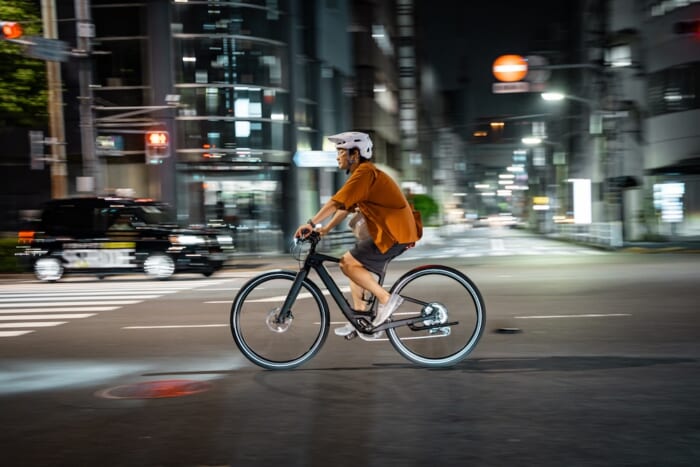
We wanted the logo to express the style of HOUYHNHNM Running Club ♡, which is "run loose and drink right," and the universality that is not influenced by trends, since we want to continue this facility for a long time. This is the logo that was finally created in response to such a theme.
In our first meeting, we talked about the similarity between the feeling of a run and that of a sauna, and we came up with the idea of "TOTONOU (revitalize)," which is a state of being able to become nothing or zero. The more we designed it, the more trendy it would look, and the simpler we made it, the more difficult it would be to express a sense of looseness. There were various patterns for the thickness and proportions of the letters, but we found the right balance through repeated hearings and refinements," said Mr. Takagi, the art director in charge of the project. The logo's simplicity and looseness, he continues, incorporate the essence of Lanstei.
The designs for the numbers and track are often large enough to stand out from a distance, so many of the small details are omitted. When I wanted to add a run element to the TOTOKEN logo, I focused on such graphics, which are often used in the world of sports. I used the bold numbers on the numbers as a reference and tried to create a run-steer feel in a less direct way.
The TOTOKEN logo expresses our core desire to "make running a culture" and our hope that the facility will be loved for years to come. We are also planning to develop merchandise using this logo, so stay tuned!