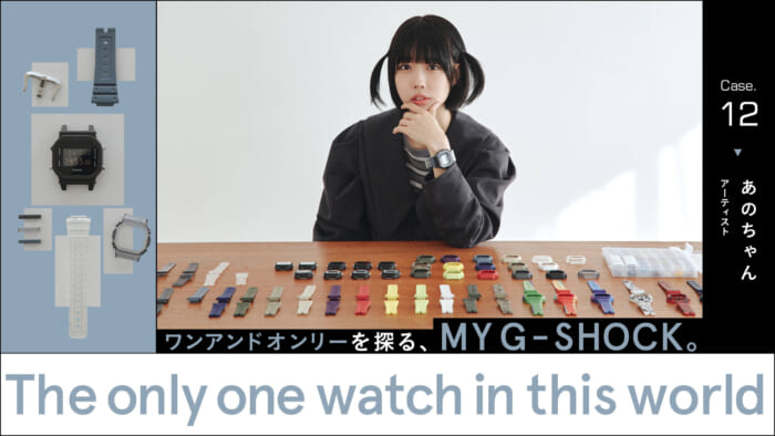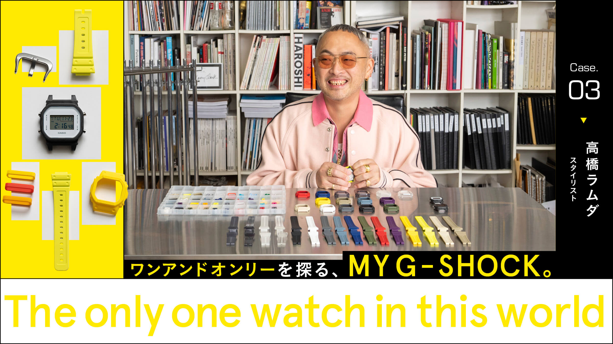
The key point is that although four colors are used, it does not appear as if multiple colors are used.
So, we re-did the color selection process again. I wanted to try a color that other people would not choose," he said, "so I decided to try again with a more difficult combination. We changed the bezel from fluorescent yellow to the normal yellow that we were interested in earlier. From there, we will match the color of the belt.

It would be interesting to use a crazy pattern, but purple is not quite right. But purple is a little different. Even if you call it a crazy pattern, it would be better to match the color tone to some extent. Well, green doesn't match well either. Even though it was a difficult challenge, I don't want people to say I have no sense of style (laughs).
While talking about this, Mr. Takahashi tries various combinations. He seems to be interested in fluorescent yellow, so we try matching a belt in that color.
It's like, "Oh, that's kind of nice! It ends up being a similar color (laughs). Maybe the belt loop is good enough to put a little point in it. Let's go with red, orange, and yellow to match the bezel as it is. Let's put this together."
The resulting combination is shown here. The dial is white with a clear background as before. The buckle is silver to match the bright color scheme.
'This is kind of cool. It goes well with gold jewelry. I like this super pop look. I used four colors: yellow, fluorescent yellow, orange, and red, but it doesn't look like I used a lot of colors. I like this one better than the one I made earlier. So, this is the one I'm going to use.