In the 1990s, the term "vintage" was used to describe vintage clothing that did not meet the definition of "antique," but still had value, as opposed to "antique" clothing that was 100 years old. Nowadays, there is a movement to find new value in "new vintage," even in old clothes from the 1980s onward, which used to be called "regular" vintage clothes. In this project, four vintage clothing stores with different styles propose new ways to enjoy vintage clothing. Each of them will talk about the charm of vintage clothing with their own sense of style.
Before we knew it, this series has entered its 18th season, and we’re bringing it to you from a new shop. For the 144th installment—the finale of the 18th season—we’re back at “dojoe” in Yoyogi-Uehara for our second visit! What kind of new vintage finds will staff member Ogawa introduce to us!?
Text_Tommy
Edit_Yosuke Ishii
Sota Ogawa / dojoe Staff
Vol. 144_Motion Font T-Shirt
—Let’s get right to it: What exactly is this “New Vintage” you’re introducing today?
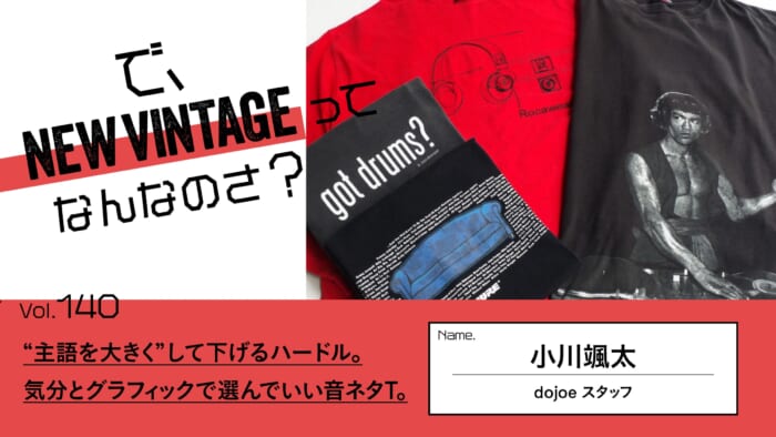
It’s definitely fall now, but following up on my last post, I’d like to stick with T-shirts. The topic is “motion fonts”—basically, those “blurred letters.”
—Oh! SUPREME had something like that, too, didn’t they? I hear that one was inspired by the title sequence for the movie *Goodfellas*, designed by the renowned American graphic designer Saul Bass.
It’s true that Supreme released it as a “motion logo,” but even though it’s the same animation, it feels a little different from what’s commonly referred to in the vintage fashion scene. If I mention that Balenciaga sampled it a few years ago, I think many people will recognize the original source. In fact, that’s what sparked the trend, and over the past year or two, the market price of the original item has skyrocketed.
—Oh, really? Has the “motion font” genre been around for a long time?
It’s only recently that I’ve started hearing about this a lot. I used to call it the “wobbly font” or the “drunk font.” So, without further ado, I’d like to show you what it actually looks like.

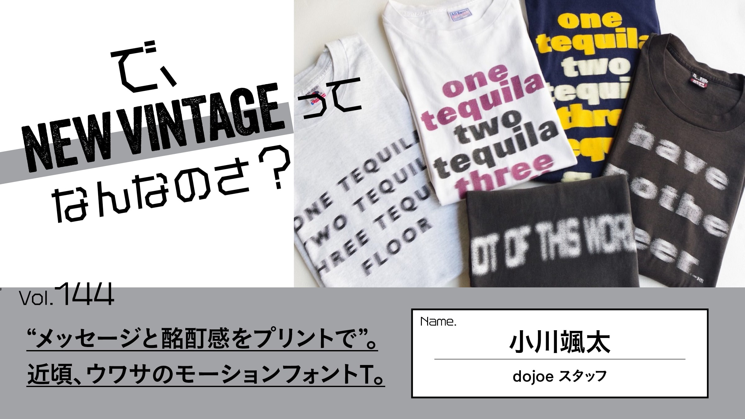
T-shirt featuring the motion font “one tequila two tequila three tequila floor” ¥12,100(Dojo)
T-shirt featuring the motion font “one tequila two tequila three tequila floor” ¥12,100(Dojo)
—What kind of message is this design meant to convey?
It features the well-known American phrase, “One tequila, two tequila, three tequila, floor.” It’s a classic drunk joke popular in bars and pubs—meaning “if you drink three shots of tequila, you’ll end up on the floor”—so the message is basically alcohol-related. In that sense, I guess it falls under the “joke” category.
—Something's wrong with the handout...
That’s right! The print is meant to convey the blurry vision you get when you’re drunk. So, in the sense of “blur,” it might be considered motion, but it’s not as cool as something like *Supreme* (laughs). I’ve prepared two prints this time; while the layouts are almost identical, they’re from different creators… or rather, since it’s such a classic, cliché-like theme, I guess it’s more accurate to say, “I’ve prepared two out of the countless versions that exist.”
—So, in modern terms, these are T-shirts featuring internet meme-style designs, right?
In internet terms, you’d think they’d be copy-and-pasted, but there are slight differences between each one, and that’s part of the fun. Looking at these two photos, the one with the white body manages to stay somewhat coherent up to the third shot (three tequila), while the one with the navy body’s vision is already starting to get pretty blurry by the second shot (two tequila). And take this one, for example—it’s been completely blurry from the very first shot (one tequila) all the way through (lol).
T-shirt featuring the motion font “ONE TEEQUILA TWO TEEQUILA THREE TEEQUILA FLOOR” ¥9,900(Dojo)
—After all, everyone’s tolerance for alcohol is different (lol). Next up is this one, which features a different message.
“Have Another Beer” Motion Font T-Shirt ¥11,000(Dojo)
This one says “have another beer,” so the vibe is kind of like “Another beer, please!” Since all the letters are all blurry, I must’ve had way too much to drink (lol). The faded look of the bottle also has just the right amount of wear and tear—it’s a perfect match for this message.
—The last one carries a different message.
“NOT OF THIS WORLD” Motion Font T-shirt ¥8,800(Dojo)
The front reads “NOT OF THIS WORLD.” On the back is a flying bicycle set against a giant full moon. It’s a parody of the classic sci-fi movie *E.T.*. By the way, the message on the front is slang meaning “so amazing it’s out of this world.”
—It has a copyright notice, too.
“It says ”Mellow Mushroom Art 2002,” so I looked it up and think it might be merchandise from the American pizza restaurant chain “Mellow Mushroom.” If you look closely, the character in the front basket of the bike is holding a pizza, and doesn’t the silhouette of the character pedaling look a bit like a mushroom?
—That's true!
A quick Google search reveals that “since its founding in 1974, the company has cherished the psychedelic and unique artwork, murals, and original designs that vary from store to store.” If that’s the case, it sounds like a corporate brand with ties to psychedelic drug culture. Since motion fonts aren’t commonly used outside the alcohol industry, I think this is a pretty rare example.
—When you put it that way, it’s less of a blur and more of a kind of lightheaded, floaty feeling, I guess… In any case, it’s a unique item that only screen printing can produce.
That’s right. The cynical message feels uniquely American, and I was drawn to how the meaning of that message is so closely linked to the print design—which is why I decided to feature it here. I believe all of these were created by intentionally blurring the boundaries of the design data, converting it into fine dots (screen dots) through halftone processing, and then making plates to print them. Since the overall impression of the blur changes depending on the dot size, it might be interesting to look for them with that in mind.
Sota Ogawa / dojoe Staff
He joined “dojoe”—a vintage clothing store with a large following within the industry thanks to its excellent taste and foresight in sourcing imported and used items from the U.S.—at the age of 23 after graduating from college, and currently works there as a staff member. His hobby is going to the sauna.
Instagram:@dojoe_tokyo